
UX and Design Strategy
Digital Onboarding Redesign
Role
Design Strategist/UX designer and supervisor for the research team.
Methods
Result
-
Delivered a complete redesign of the onboarding app in 6 weeks.
-
Reduced PCP-related calls by over 20%
-
Increased motivation and ability to select PCP and make initial payment (based on user testing and reflected in metrics).
-
Created scalable model for use by other lines of business.
-
Created an extended roadmap of additional improvements and features.
Summary
Creating a Confident Path to Healthcare Coverage
Health Net's ACA (Obamacare) plans were struggling with enrollment numbers and member satisfaction. Journey mapping revealed a critical pain point: the “dark period” between selecting a plan on Covered California's website and receiving the ID card, during which members received minimal communication, was creating anxiety and confusion for new members. A key driver was an outdated Welcome Center application that was contributing to enrollment errors, driving high call volumes, and increasing member frustration.
Constraints & Opportunity
Following Centene's acquisition of Health Net, system changes were heavily restricted due to ongoing integration efforts. However, when we learned the Welcome Center required technical maintenance, we saw an opportunity. We negotiated with IT to incorporate a user experience redesign within their planned update, provided we stayed within the 6-week timeline and limited changes to front-end modifications only.
Approach
We focused on three key objectives:
-
Minimize auto-assigned primary care provider complaints
-
Increase on-time first payments to prevent coverage delays
-
Reduce anxiety during the transition period between plan selection and ID card receipt
For the design, I leveraged self-determination theory principles of autonomy, competence, and relatedness to encourage people to complete the key tasks. In addition, the process included:
-
Deep analysis of customer feedback and call center data
-
Journey mapping sessions with cross-functional teams
-
Iterative prototyping and user testing
-
Close collaboration with front-end developers to ensure feasibility
Impact
The redesigned Welcome Center delivered significant improvements:
-
20%+ reduction in PCP selection and change-related calls
-
Higher completion rates for PCP selection and initial payments
-
Increased user confidence, even when deferring tasks
-
Created scalable blueprint for member-facing applications across other business lines
The project demonstrated how thoughtful UX design could drive substantial business value even within strict technical constraints. By focusing on reducing anxiety and increasing user autonomy, we transformed a friction point into a smooth onboarding experience.

Discovery
Evaluating the Current State
In California, people who want health plans on the ACA exchange must go through a site called Covered California. After selecting Health Net as their plan, members clicked “Pay Now” and were redirected to Health Net's "Welcome Center" for what appeared to be a simple final step. In reality, however, members still needed to select a doctor for each person in their family in addition to selecting a payment option, which created misaligned expectations.
In addition, members arrived at the Welcome Center page to encounter an interface that one user described as looking like "a bag of Skittles exploded on the screen." The interface bombarded already-fatigued users with poorly designed interactions, dense instructions, and additional unexpected decisions, leading people to make mistakes or simply abandon the process.
This interface failure had serious repercussions:
-
Unwanted Provider Assignments: When members didn't select a Primary Care Provider (PCP) or made a mistake during the selection, Health Net would auto-assign one without explanation. This led to angry members, overwhelmed call centers, and damaged trust out of the gate.
-
Coverage Gaps: Members who didn't complete payment within a week faced delayed coverage. Many didn't discover this until they needed to see a doctor and realized their ID cards had not arrived.
“This is just like a bag of Skittles exploded onto the screen. It should be broken out. Like, you select this first, then it takes to the next questions, then it takes you to this one…”
KS, Covered CA Shopper

The original interface was cluttered and had multiple usability issues.
Concept Development
Designing for Human Psychology
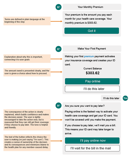
The challenge of redesigning the experience went beyond simplifying the interface. We were asking users to make complex decisions while already experiencing decision fatigue from selecting their health plan. To address this, I turned to Self-Determination Theory (SDT), which suggests that people are more likely to engage when three core psychological needs are met: competence, autonomy, and relatedness.

Building Competence
We designed the experience to help users feel capable and confident:
-
Broke complex decisions into digestible, sequential steps
-
Provided clear, concise explanations with defined terminology
-
Created unambiguous button labels that previewed outcomes
-
Included "undo" options to reduce anxiety about mistakes
Preserving Autonomy
Rather than forcing users down a predetermined path, we empowered informed choice:
-
Presented clear options with transparent consequences
-
Reframed yes/no decisions as choices between two valid paths
-
Used neutral, supportive language for all options
-
Surfaced crucial decision-making information (like payment amounts) upfront
Fostering Relatedness
We created a more human, connected experience through:
-
Conversational interface design that felt like a helpful dialogue
-
Plain language that avoided institutional tone
-
Contextual feedback and encouragement throughout the journey
This psychology-based approach helped transform an overwhelming process into a supportive experience that respected users' cognitive state while guiding them toward successful outcomes.


The redesign reduced errors while allowing for easy recovery.
Evaluation
Usability Testing
Yeah I love it. This is so simple, actually that there isn't all this extraneous stuff. Because it's so easy to get overwhelmed when shopping for insurance. And I find the extraneous marketing like the pictures of families in meadows and stuff I find all that stuff a little bit annoying...I think this is great. I'm impressed with the simplicity of it and I feel like it's very complete.
MB, Covered CA Shopper
After completing the first prototype, we did a quick round of usability testing with people shopping for plans on Covered California. The feedback was overwhelmingly positive: all seven participants rated the ease of use as 7 or higher on a scale of 1-10. For most participants, being asked "are you sure?" and being presented with the consequences was enough for them to change their decisions. Participants also appreciated:
-
Being guided through the process. They described as seamless and simple.
-
Explanations for why it was important to take each step.
-
The final summary screen explaining what was completed and what to expect next.
They also gave us some ideas for improvement, much of which we were able to implement before the final release. These included:
-
Provide more assistance for choosing a provider. These were added as optional tips the user could view.
-
Include a link to the plan they selected so that they can refer back to it. We added this.
-
Understand how to select a specialist as a PCP. We were not able to add this due to technical constraints, but we included a phone number in the step itself so people could get help immediately.
-
Explain why they needed to pay now if their application was not yet approved. We removed the language about approval from the app to clarify.
-
Allow the option to return to a previous step. We weren't able to incorporate this in the first few versions due to technical limitations.
-
Add the payment confirmation in the app itself. For technical reasons related to a vendor product, we were not able to do this, so we were forced to ask users to confirm whether they had completed the payment. We kept it as a high priority backlog item.
-
Add the ability to sign up for the member portal or download the app. This was also added as a backlog item.
-
Update the color scheme to look more modern. We were a few months out from a rebrand, so we were able to incorporate this in a later iteration.
"So when I see this [that my ID card and coverage will be delayed], I'm actually gonna pay it right now. Because I don't want to have there being a hold up on my health insurance. Because I want to get my card right away.”
MB, Covered CA Shopper
"So once I saw this [that Health Net will assign a doctor if I don't pick one], I would go back in and do my research and pick a doctor for [my son]. Because what I will not have is someone assigning me anything…"
KS, Covered CA Shopper
"I appreciate having concrete information and a plan here [on the final summary screen]. So I know what to expect. I also have time frames so that if I don't get this in five to 10 days, I know I need to contact somebody. If I don't get my I.D. card in one or two weeks, I know I have to contact somebody. So on and so forth. I like that."
RM, Covered CA Shopper
Impact and Legacy
An Improved Experience and a Blueprint for New Projects
The redesigned Welcome Center delivered significant improvements:
-
Substantial reduction in PCP assignment errors and related member complaints
-
Higher on-time payment completion rates
-
Increased member confidence and understanding of coverage timelines
-
Measurable reduction in anxiety-driven support calls
Beyond the immediate metrics, this project proved transformative for the organization. By delivering meaningful results within tight technical constraints and a 6-week timeline, we demonstrated the power of thoughtful UX design to drive business value. The success became our blueprint for improving member-facing applications across other lines of business, establishing a new standard for digital experience at Health Net.